
Color and Contrast
Crafting Visually Accessible Websites
3 minute read
Color and contrast are powerful tools in conveying meaning, function, and emotion on websites and applications. However, it’s crucial to recognize that these elements are perceived differently by individuals, impacting their experience with them.
Welcome back to our series on designing accessible websites. Having laid the groundwork on accessibility basics and team roles, let’s turn our attention to a crucial, yet often overlooked, aspect of accessible design — color and contrast.
Understanding Color Accessibility
Color is a powerful tool in interface design, but it’s important to remember that not everyone perceives color in the same way. Color vision deficiencies, such as color blindness, can significantly alter how users interact with your website.
The Challenge of Color Blindness
As someone who deals with (admittedly mild) protanopia, I have a personal understanding of the challenges faced by those with color vision deficiencies. In fact, it’s more common than you might think. Color blindness affects approximately 1 in 12 men and 1 in 200 women globally. This means a substantial portion of your audience might not distinguish certain colors — a red error message might go unnoticed, or a green ‘success’ indicator might not make sense.
More Than Just Color
Relying solely on color to convey information can be problematic. It’s crucial to use additional cues — like text labels or icons — to ensure that all users can navigate your content effectively.
The Role of Contrast
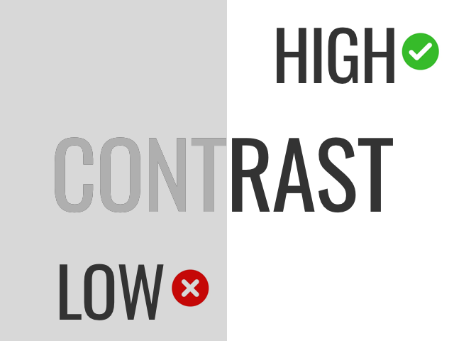
Contrast is not just an aesthetic choice; it’s a key factor in making your website usable for people with visual impairments and those viewing it in less-than-ideal lighting conditions.
Understanding Contrast Ratios
The contrast ratio between text and its background can mean the difference between readable content and a jumbled mess. The WCAG recommends a contrast ratio of at least 4.5:1 for normal text and 3:1 for large text.
Tools for Checking Contrast
Thankfully, there are tools to help you get this right:
Best Practices for Color and Contrast
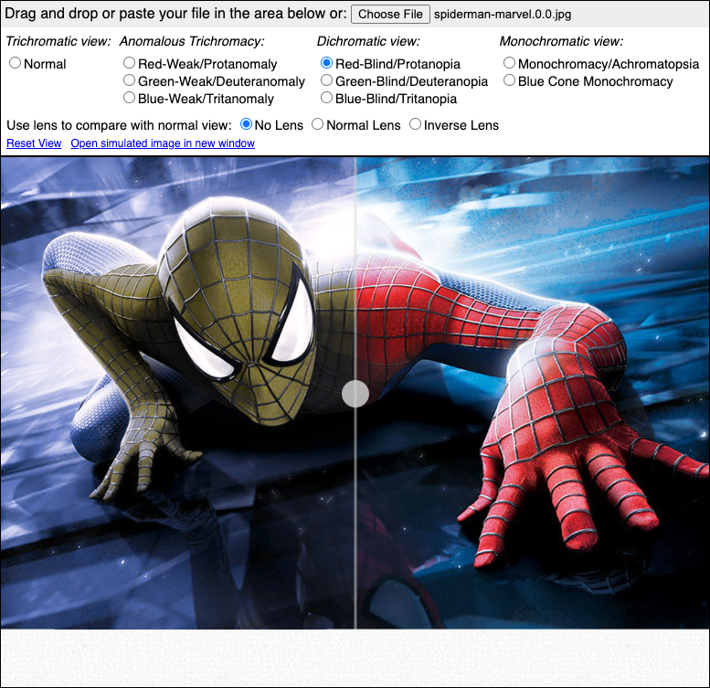
The Coblis color blindness simulator is a great tool for showing you what someone with the condition sees when using your site.
Selecting Accessible Color Schemes
When choosing colors for your website, consider how different combinations might appear to someone with color vision deficiencies. Tools like Coblis — Color Blindness Simulator can help you visualize your palette through their eyes.
Designing for Different Types of Color Vision Deficiencies
Color vision deficiencies vary, and understanding these variations is key to creating an inclusive design. Here’s a closer look at the three common types:
Protanopia (Red-Green Color Blindness)
- What is it: Protanopia is a type of red-green color blindness where the red cones in the eye are absent or malfunctioning. People with protanopia often confuse reds with greens, and greens with blacks.
- Design Considerations: Avoid using red and green as the only visual cues. Instead, use textures or patterns, and ensure that information conveyed through color is also available through other means.
Deuteranopia (Green Color Blindness)
- What is it: Deuteranopia is another form of red-green color blindness, where green cones are absent or not working correctly. It leads to difficulties in distinguishing between greens, reds, and yellows.
- Design Considerations: Similar to protanopia, it’s important to avoid relying solely on color distinctions between reds, greens, and yellows. Incorporate distinct symbols or shapes to convey critical information.
Tritanopia (Blue-Yellow Color Blindness)
- What is it: Tritanopia is a much rarer form of color blindness affecting the blue cones in the eyes. People with tritanopia have trouble distinguishing between blues and greens, and also between yellows and violets.
- Design Considerations: Use a combination of color, text, and shape to ensure information is accessible. Be cautious with color combinations like blue-green and yellow-violet, which may appear similar to someone with tritanopia.
Implementing Accessible Colors and Contrast in Development
For developers, implementing accessible color schemes means more than just choosing the right palette. It involves:
- Writing CSS with best practices for color and contrast in mind.
- Regularly testing your website with color contrast tools.
- Ensuring that all interactive elements meet the minimum contrast requirements.
By understanding the importance of color and contrast in accessibility, we can create websites that are not only visually appealing but also inclusive. In our next article, we will dive into the world of keyboard navigation and its pivotal role in accessibility.
Next Up: Screen Navigation Tips and Techniques
Next up in our series on accessibility is a look at keyboard navigation; why it’s important and how to go about making your websites and apps run smoothly for users who may not have access to other, more common, input devices. Stay tuned!
What are your thoughts? Join me in the conversation over on Bluesky Social and LinkedIn
Originally published June 20, 2023
File under:
ux
accessibility