
Navigating Accessibility
Mastering Keyboard-Friendly Design
8 minute read
Keyboard navigation is essential for many users, including those with motor disabilities, temporary injuries, or a preference for keyboard use. It involves more than tabbing through links; it’s about ensuring all interactive elements are accessible without a mouse.
Welcome back to our deep dive into web accessibility. After exploring color and contrast, we now focus on a vital yet often overlooked aspect: keyboard navigation. While primarily aimed at users with motor disabilities; it’s for anyone who relies on a keyboard to navigate the web. This could include people with temporary disabilities (being forced, for instance, to use their non-dominant hand due to an injury), or a power-user who prefers to do as much navigating via the keyboard as possible.
Best Practices for Keyboard-Friendly Design
Creating a keyboard-friendly website involves thoughtful design and coding. Here are some essential practices:
Designing Intuitive Tab Navigation
Ensure logical tab order follows the natural reading sequence. This helps users predict which element will receive focus next and avoids tab traps where users can get stuck.
Interactive Elements and Keyboard Accessibility
All interactive elements (links, buttons, form fields) should be operable with a keyboard, avoiding reliance on mouse-only actions like on-hover.
Visual Indicators for Keyboard Focus
Provide clear focus styles, such as borders or color changes, to show which element is currently focused. Here’s an example of what that might look like on your website:
HTML
Suppose you have a simple navigation menu:
<nav>
  <ul>
    <li><a href="#home">Home</a></li>
    <li><a href="#about">About</a></li>
    <li><a href="#services">Services</a></li>
    <li><a href="#contact">Contact</a></li>
  </ul>
</nav>
CSS
You can add focus styles to the anchor tags within your navigation menu:
nav a {
  color: #000; /* Normal text color */
  padding: 5px;
  text-decoration: none;
}

nav a:focus {
  outline: none;
  border: 2px solid blue; /* Blue border for focused elements */
  color: red; /* Change text color when focused */
  background-color: yellow; /* Background color for focused elements */
}
In this example, when any of the navigation links (<a>) receive focus (usually via tabbing with the keyboard), they are highlighted with a blue border, red text, and a yellow background. This change in style makes it evident which link is currently focused, aiding keyboard-only users in navigating your site.
Remember to choose focus styles that stand out against the rest of your site’s design and are easily noticeable to users.
Logical Tab Order Without Manual Specification
It’s best to let the browser handle the tab order based on the HTML document’s flow, ensuring a logical and intuitive navigation experience. This includes ensuring primary navigation is accessible through tabbing.
If, for some reason, you need to force a certain tab order, you can do so with the tabindex property. Here’s a simple HTML and CSS example:
HTML
Imagine a web form with different input elements:
<form>
  <input type="text" placeholder="First Name" tabindex="1">
  <input type="text" placeholder="Last Name" tabindex="3">
  <input type="email" placeholder="Email" tabindex="4">
  <textarea placeholder="Your Message" tabindex="2"></textarea>
  <button type="submit" tabindex="5">Submit</button>
</form>
In this example, tabindex attributes are used to define the order in which users will navigate through the fields using the keyboard.
CSS
To visually indicate focus, you might add:
input:focus, textarea:focus, button:focus {
  outline: 2px solid blue;
}
This CSS provides a blue outline around any focused input, textarea, or button element, enhancing the visual feedback for keyboard navigation.
In this example, tabbing through the form would start with First Name, then jump to Your Message, then Last Name, then Email, and finally the Submit button. You can try it here:
Confusing, no?
Important Note
While tabindex can be helpful, it should be used sparingly. As the example above illustrates, overuse or incorrect use can disrupt the natural navigation flow and lead to a confusing experience. It’s generally best to structure your HTML in a way that the default tab order aligns with the intended navigation sequence. Manual specification should be reserved for specific cases where this isn’t achievable through HTML structure alone.
The Significance of Semantic HTML in Keyboard Navigation
Semantic HTML uses tags that describe their content and purpose, like <nav> for navigation or <button> for clickable actions. It’s crucial for natural keyboard accessibility and screen reader compatibility, maintaining a logical content flow.
Maintaining a Logical Flow: The Role of Hierarchical Headings
In the realm of semantic HTML, maintaining a logical flow extends beyond choosing the right elements; it also involves structuring these elements in a hierarchical and intuitive manner. This is particularly relevant when we talk about heading tags in your HTML structure.
The Hierarchy of Heading Tags
Heading tags, ranging from <h1> to <h6>, aren’t just about size or visual prominence; they represent the hierarchy of content on your page. It’s like organizing the chapters of a book: you wouldn’t place a subchapter before the main chapter, would you? Similarly, in web design, the structure of your heading tags should reflect the importance and sequence of your content.
Why Hierarchical Structure Matters
- Ease of Navigation: For users relying on keyboard navigation, especially those using screen readers, a hierarchical structure of headings allows for smoother and more predictable navigation through the content.
- Contextual Clarity: Properly structured headings provide context and relevance to each section of your web page, making it easier for users to understand the layout and content of your site.
- Enhanced SEO: Search engines favor well-structured content. Using headings in a logical sequence improves your site’s SEO, making it more discoverable and user-friendly.
Integrating Hierarchical Headings with Semantic HTML
When combined with the proper use of semantic HTML elements, hierarchical heading structures fortify the overall accessibility of your website. They ensure that everyone, regardless of their method of navigation, can traverse your site with ease and comprehension. In our continued commitment to crafting accessible digital experiences, it’s these nuances of web structure and design that make all the difference.
Demystifying ARIA Roles: Enhancing Accessibility Beyond HTML
While semantic HTML lays the foundation for accessibility, there are scenarios where it reaches its limits. This is where ARIA (Accessible Rich Internet Applications) roles come into play, acting as a toolkit to enhance web accessibility, especially in complex web applications.
Understanding ARIA Roles
ARIA roles provide additional context to assistive technologies about the purpose of an element. They are particularly useful in situations where standard HTML elements fall short in conveying the role or state of an element. ARIA roles tell screen readers and other assistive technologies what an element is and how it should be interacted with.
How ARIA Roles Enhance Accessibility
- Defining Complex Widgets: In web applications with custom widgets that don’t have native HTML equivalents (like sliders, drop-downs, or modal dialogs), ARIA roles can define these elements for assistive technologies.
- Improving Navigation: ARIA landmark roles help users navigate more efficiently by defining areas like banners, main content, navigation, and search.
Common ARIA Roles and Their Implementation
Role="button": When a div, span, or another non-button element is visually and functionally a button but cannot be a<button>for some reason:
<div role="button" tabindex="0">Click me</div>
Role="navigation": Identifies a section of the page that serves as a navigation menu.
<div role="navigation">
    <nav>
        <ul>
            <li><a href="#home">Home</a></li>
            <li><a href="#about">About</a></li>
            <li><a href="#services">Services</a></li>
            <li><a href="#contact">Contact</a></li>
        </ul>
    </nav>
</div>
Role="alert": For error messages or important updates. This role is automatically announced by screen readers.
<div role="alert">Error: Please fill out this field.</div>
ARIA-labelledbyandARIA-describedby: These attributes link elements to their labels or descriptions, especially when visual labels aren’t sufficient.
<input id="name" type="text" aria-labelledby="nameLabel" /><span id="nameLabel">Name:</span>
<input id="password" type="password" aria-describedby="passwordHint" />
<span id="passwordHint">Password must be 8 characters long.</span>
Best Practices for Using ARIA
- Use Native HTML First: Always prefer using native HTML elements over ARIA roles wherever possible. ARIA should be your go-to when HTML falls short.
- Do Not Change Native Semantics: Avoid changing the inherent semantics of an HTML element with ARIA roles.
- Test with Screen Readers: Testing with actual screen readers is crucial to ensure that ARIA roles are correctly implemented and interpreted.
ARIA roles are a powerful tool in the web accessibility toolkit, bridging gaps where semantic HTML is not enough. They empower designers and developers to create more accessible and user-friendly web experiences, particularly for complex, interactive web applications.
Leveraging JavaScript for Enhanced Web Accessibility
While HTML and ARIA play pivotal roles in structuring accessible content, JavaScript can be a valuable ally in enhancing navigability, especially for dynamic content and complex interactions. However, it’s crucial to use JavaScript judiciously, keeping in mind that it can be disabled in some browsers or by certain assistive technologies.
The Role of JavaScript in Accessibility
JavaScript can dynamically update the DOM, manage focus, and handle complex interactions, making it a powerful tool for improving the accessibility of web applications. It’s particularly useful for:
- Managing Focus: In dynamic applications, JavaScript can be used to direct the user’s focus to relevant content, such as opening a modal window or revealing hidden content.
- Custom Keyboard Shortcuts: JavaScript enables the creation of custom keyboard shortcuts for navigating web applications, enhancing usability for power users and those reliant on keyboards.
- Dynamic Content Updates: It can be used to update content without reloading the page, which is essential for screen reader users to receive up-to-date information.
Caution and Best Practices
- Progressive Enhancement: Design your web applications with progressive enhancement in mind. Basic functionality should be accessible even if JavaScript is disabled.
- Avoid Over-reliance on Javascript: Ensure that essential content and navigation can be accessed without JavaScript. This not only caters to users who disable JavaScript but also to those using older or more limited devices and browsers.
JavaScript Examples for Improved Navigability
- Managing Focus on Modal Open and Close:
// When a modal opens
document.getElementById('myModal').style.display = 'block';
document.getElementById('modalContent').focus();

// When the modal closes
document.getElementById('myModal').style.display = 'none';
document.getElementById('openModalButton').focus();
- Custom Keyboard Navigation:
document.addEventListener('keydown', function(event) {
    if (event.key === 'ArrowRight') {
        // Move to next item
    }
    if (event.key === 'ArrowLeft') {
        // Move to previous item
    }
});
- Dynamically Updating ARIA Attributes:
function toggleMenu() {
    var menu = document.getElementById('dropdownMenu');
    var isExpanded = menu.getAttribute('aria-expanded') === 'true';
    menu.setAttribute('aria-expanded', !isExpanded);
}
JavaScript, when used correctly, can significantly enhance the accessibility of web applications. Its ability to manage focus, create custom navigation, and dynamically update content makes it a valuable tool in the accessible web design toolbox. However, the key is to use it as a complement to, not a replacement for, solid HTML and ARIA practices.
Tools for Testing Keyboard Accessibility
Ensuring your website is navigable via keyboard is a critical aspect of accessibility. Fortunately, there are automated tools that can assist in testing and identifying areas for improvement. Here are some examples of tools you can use:
- WAVE (Web Accessibility Evaluation Tool)
WAVE is a suite of evaluation tools that helps authors make their web content more accessible to individuals with disabilities. It provides visual feedback about the accessibility of your web content by injecting icons and indicators into your page. It can highlight potential keyboard navigation issues, such as missing focus indicators or illogical tab sequences. - axe Accessibility Checker
The axe browser extension is a powerful tool for accessibility testing, offering both automated and guided tests. It includes tests for keyboard accessibility, ensuring that all content and functions are accessible via the keyboard.
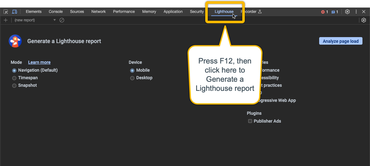
Press F12, then click here to generate a Lighthouse report
- Google Lighthouse
Lighthouse is an open-source, automated tool for improving the quality of web pages. It has audits for performance, accessibility, progressive web apps, and more. It’s accessibility audit includes checks for keyboard access and visible focus, and it provides a score along with recommendations for improvements. Best of all, if you use Chrome (or any Chromium-based browser like Edge, or Brave)as your web browser, it’s built right in (F12on Windows and Mac).
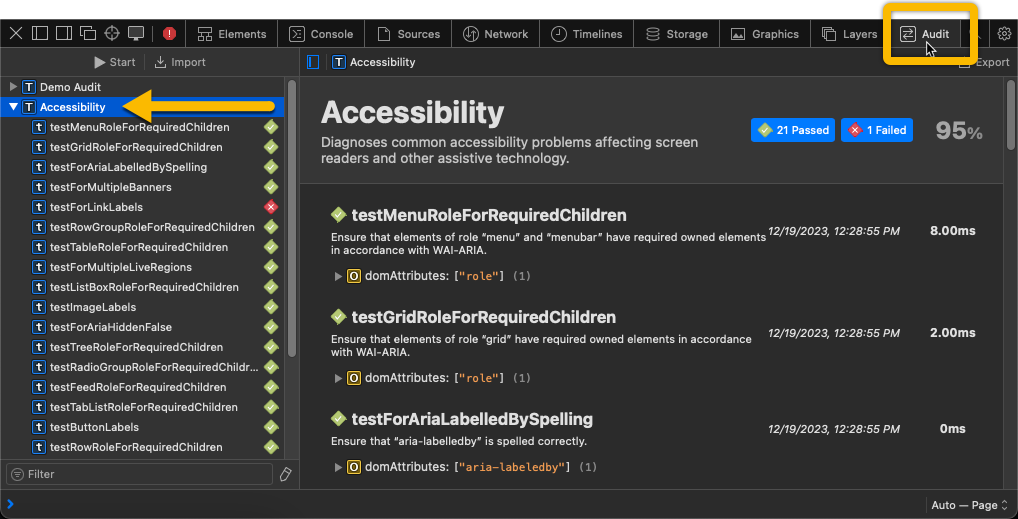
Press ⌥⌘I, click the Audit tab, then Accessibility
-
Accessibility Audits in Safari If you’re on a Mac and use the built-in Safari web browser, you can access its built-in accessibility audit tool (press
⌥⌘I) to identify issues that need addressing, including keyboard navigation problems. -
Keyboard Accessibility Testing in Browsers
Simple yet effective, manually testing your website using only a keyboard can provide valuable insights. This involves navigating through your site using the Tab key, arrow keys, and Enter key to ensure all interactive elements are accessible and functional. Check for focusable elements, logical tab order, and visible focus indicators.
Mastering keyboard-friendly design is a critical step in creating accessible web experiences. From understanding the importance of keyboard navigation for a diverse range of users to implementing best practices in design and development, every aspect plays a pivotal role. Employing semantic HTML, utilizing ARIA roles judiciously, and enhancing functionality with JavaScript are key to making websites more intuitive and navigable.
Moreover, clear visual indicators for keyboard focus and the use of practical tools for testing ensure that websites cater effectively to keyboard users. By examining real-world examples, we’ve seen how implementing these strategies can result in more inclusive and user-friendly websites. As we continue to delve into accessible web design, remember that each element we improve brings us closer to a web experience that is truly accessible for all.
Stay tuned for our next article, where we’ll explore accessible content and media, further enhancing our knowledge of building an accessible web.
What are your thoughts? Join me in the conversation over on Bluesky Social and LinkedIn
Originally published July 3, 2023
File under:
ux
accessibility