 Image credit: Midjourney
I Asked ChatGPT to Fix My Website
How I Used AI to Enhance My Website’s Accessibility
2 minute read
Following up on my previous article about color and contrast ratio, it occurred to me that my own site could use a little attention in this area. It got me thinking: What would happen if I asked ChatGPT to analyze my stylesheet and make some recommendations for improvement? I wanted my contrast ratios to comply with WCAG 2.0 standards. This journey was surprisingly fruitful, yielding tangible improvements as measured by Google’s Lighthouse tool.
Step 1: Establishing the Baseline
Initially, I conducted a Lighthouse audit to establish a baseline for my website’s accessibility. The result was a score of 74, which was decent but highlighted room for improvement, particularly in the area of contrast ratios.
Step 2: Consulting with ChatGPT
Given that direct URL analysis wasn’t feasible, I copied and pasted the contents of my site’s CSS into a chat with ChatGPT 4. This approach proved effective, allowing the AI to analyze the specific color combinations I was using.
The prompt I used was incredibly simple:
Step 3: Receiving AI-Powered Recommendations

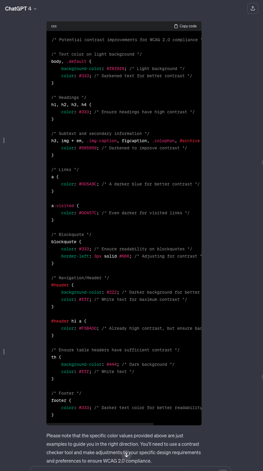
ChatGPT straight up output some new CSS to make my site’s contrast ratio comply with WCAG standards.
ChatGPT responded with several recommendations to adjust the contrast ratios in my CSS. These suggestions were detailed and included specific hex values for color adjustments. For instance, the AI advised:
- Darkening text colors against light backgrounds, like changing color: #666; to color: #595959; for better legibility.
- Enhancing link visibility by adjusting link colors to a darker shade, suggesting color: #005A9C; for links and color: #00457C; for visited links.
- Modifying background colors where necessary, such as changing lighter backgrounds to slightly darker shades to increase text readability.
Step 4: Implementing the Changes
Taking ChatGPT’s advice, I updated my site’s CSS with the recommended changes. This process involved careful adjustments to ensure that the overall aesthetic of the site remained intact while improving accessibility.
Step 5: Measuring the Impact

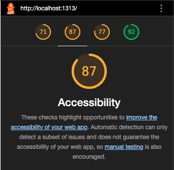
87 isn’t a bad score, but there’s still room for improvement with other accessibility criteria, which I’ll cover in more detail as we progress through this series.
After implementing the changes, I reran the Lighthouse audit. The result was an impressive increase in my score, climbing from 74 to 87. This improvement was a clear indication that the contrast ratio enhancements significantly boosted the accessibility of my site.
Conclusion
Are there other tools that give you the same utility as ChatGPT for improving your website’s contrast ratios? Sure. Would I accept the AI’s recommendations whole-heartedly without tweaking them myself? Of course not. Still, this experience underscored the potential of AI tools like ChatGPT in assisting with web accessibility tasks. By leveraging the analytical prowess of ChatGPT, I was able to make data-driven decisions that had a positive impact on my site’s accessibility score. It’s a testament to the evolving role of AI in web development and its capability to make the web a more inclusive space for everyone.
What are your thoughts? Join me in the conversation over on Threads , Bluesky Social , or Mastodon .
Originally published June 25, 2023
File under:
ux
accessibility
ai